Event landing page: a ticket conversion checklist
What an event landing page needs before you send traffic: a clear offer, credible proof, practical details and a tested path to registration or tickets.
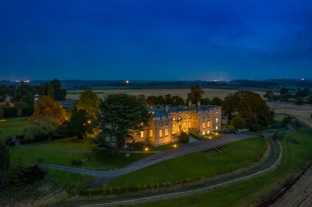
Choose one primary job for the page
An event landing page is the destination for a specific campaign. Before tickets open, its main job may be collecting registrations. Once booking is live, its main job becomes helping visitors buy. Make that action obvious and explain what happens after the click.
Match the page to the promise in the advert or email. If a campaign promotes a specific date, artist or early-access window, visitors should find that information immediately. Sending every campaign to a general calendar adds work for the buyer.
Answer the essential questions at the top
Show the event name, date, location and a concise description of the experience. Use a prominent, clearly labelled registration or ticket button. On a phone, the first screen should make sense without requiring a visitor to decipher a detailed poster.
Support the promise with relevant evidence: authentic previous-event photography, a confirmed lineup, an accurate testimonial or a specific case example. For a first edition, describe the planned experience honestly. Do not present concept imagery as documentary footage of an event that has already happened.
Remove the objections between interest and booking
Explain ticket inclusions, age restrictions, entry times, accessibility and travel information. Put the most important purchase questions near the ticket route. If prices vary by tier or date, make the distinction clear rather than letting buyers discover it late in checkout.
Use one primary action consistently throughout the page. A secondary signup can serve visitors who are not ready, but should not obscure booking. Avoid menus and pop-ups that interrupt the task the campaign brought the visitor to complete.
Test the full mobile journey
Open the actual campaign link on a phone. Check image loading, text size, form labels, validation messages and the ticketing hand-off. Test both success and failure states. Confirm that submissions reach the correct list and that a completed test order appears in reporting.
Use appropriately sized imagery and reserve space for media to reduce layout movement. Keep non-essential video and embeds out of the initial loading path. A visually impressive page still needs to respond promptly when someone taps the booking button.
Measure registration and purchase separately
Record page visits, valid registrations, ticket clicks and completed orders as different events. Compare meaningful changes to the page against the intended outcome. A higher button click rate is not enough if purchase completion falls.
For Christmas Kingdom, our documented campaign included sixteen landing page variants and a registration-first launch. That is an example of iterating the page alongside the creative, rather than treating the website as finished once it looks right.
Continue with the funnel and conversion guide, return to the event marketing strategy, or explore our event website design service.

Event marketing: strategy, promotion and practical tips
Build an event marketing strategy around your audience, ticket targets and launch calendar. A practical guide from first announcement to repeat attendance.
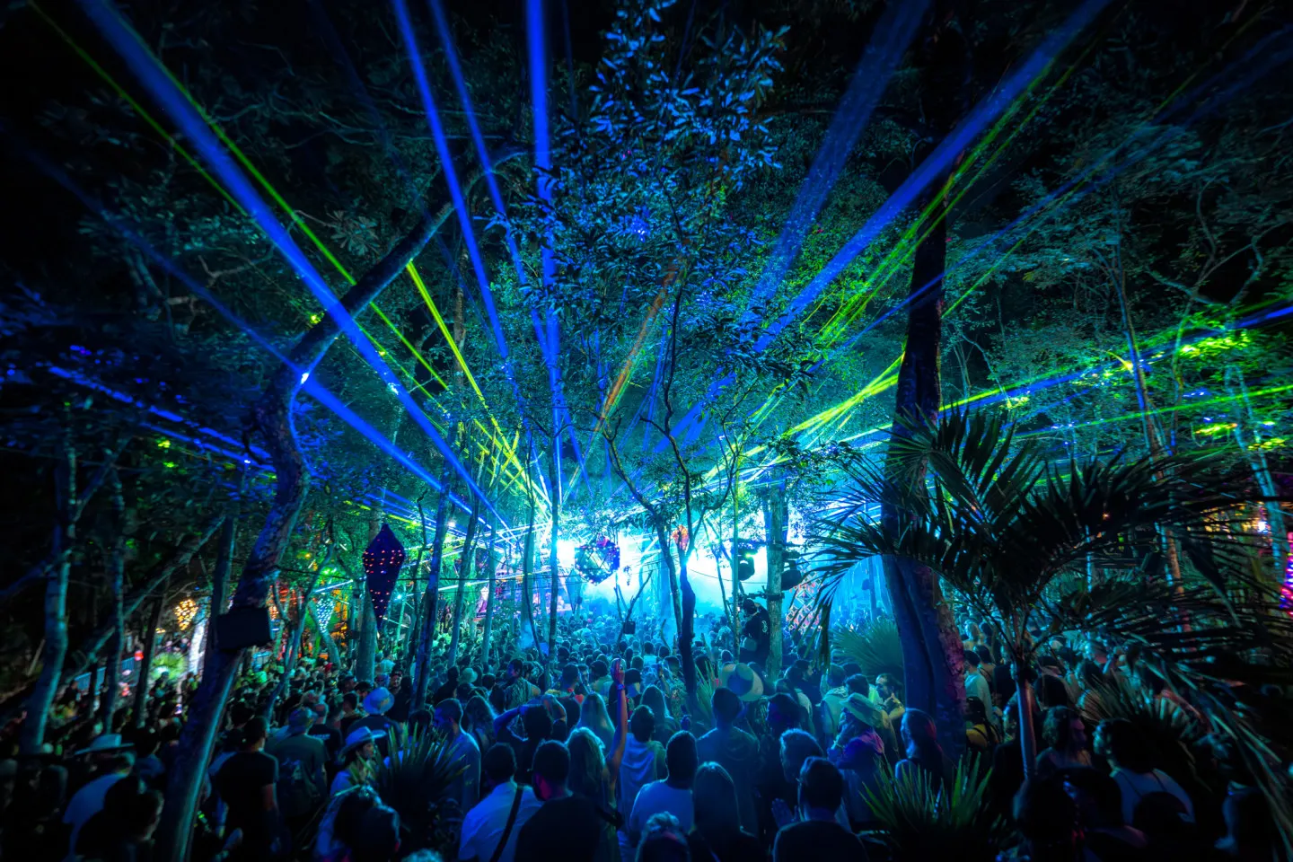
Event marketing funnel, ROI and conversion rate
Measure the journey from first visit to ticket purchase. Define conversion rates, separate ROAS from ROI and find the stage that needs attention.

The Psychology of Presales: How to Build a 5,000-Person Waitlist That Converts at 35%+
A pre-registration list that converts at 8% is a vanity metric. Here is how to engineer viral referral loops, high-value incentives, and SMS/WhatsApp presale sequences that convert over 35% of signups on launch day.
Engineered to sell out.
Ready to upgrade your campaign pacing, WhatsApp infrastructure, and server-side tracking?